There are awesome people out there who do amazing things, but in an information heavy market, it can be hard to reach out in a way that captures attention. This is something I am learning about for myself as Hauangi makes gradual steps out into the big wide world. But somehow, as always, it’s easier to help others with their challenges rather than pull the weeds in my own garden! Word of mouth is a wonderful thing, but sometimes a strong brand needs to also be visually recognisable to stick in the memory of the individual. That’s where design is essential, and something I can help with.
For over 20 years, tuma has been a brand that has been in the region of Te Awa Kairangi, Lower Hutt; heard about in close community circles but no further. To its credit, it is a very memorable name that is easy to say and takes elements from the words of its offering: tū mau taiaha, tū mau rākau – to stand and to hold a taiaha or rākau (a māori fighting weapon).
When I first was sent some information about the brand, my inbox was met with an all caps TUMA in bold 72pt Calbri, set unevely inside a glaring bright red oval shape with a black outline. My eyes screamed in pain. If nothing else, that was the first thing that needed to change.
Colour theory is something that I spent a bit of time learning about for architecture and design, particularly in the healthcare environments where some colours are seen as taboo due to their references to blood or illness. Here the message and intent were different. But, nevertheless, where red is seen as an energetic colour it can also be considered aggressive and we needed something that talked more to a calm and controlled practice. Mau rākau seeks balance between the aggressive and peaceful parts of the inner person, to bring health and wellbeing to tinana (body), hinengaro (mind) and wairua (spirit). It is a practice born of the forest and the tools given by the Māori forest deity Tāne. Māori legend speaks of the deity of war Tūmateuenga seeking the best timber from the forest for his weapon and accepting Akerautangi from the Akeake tree for a taiaha.
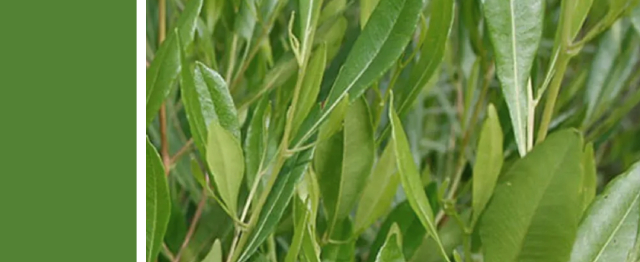
Green – taken from the forest, it is the colour of balance, of relaxation and energy, of health and renewal, and of hope for a prosperous future. That is a much more positive message!
Next I needed to address the font: something modern but welcoming and timeless and adaptable to different contexts and backgrounds.

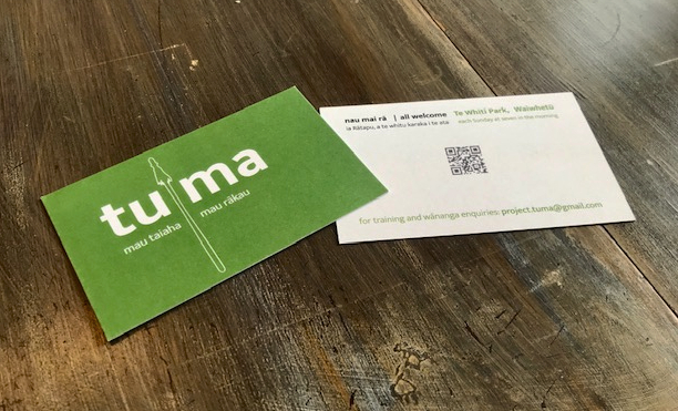
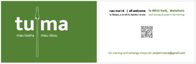
And finally, after adjusting it for print for the book, email and marketing, I was asked to develop a business card, with a graphic that signaled towards the subject.
The result is a simple taiaha outline that cuts through the centre of the logo and is underlined by the words mau taiaha and mau rākau. On the reverse, is just the most essential information and a QR code that connects to the website for more detail. Printed on matt recycled paper stock, the cards can be easily written on and recycled again.
Now, to compliment the conversation, you might just get hold of a card that you can take with you as a reminder.
“Ko te pae tawhiti whāia kia tata, ko te pae tata whakamaua kia tīna.”
Bring far horizons closer; the potential for tomorrow depends on what we do today.